
The second data visualization technique we will cover is a histogram. Histograms are used to visualize the distribution of a numerical
variable. Both discrete and continuous numerical variables can be visualized using a histogram. A histogram involves binning
the numerical variable and seeing its distribution over all its values. Each row is put into a bin that represents a certain range, and the
histogram is the result of binning every row and seeing the counts of each bin.
The histogram block takes in 6 arguments, 2 that are required and 4 that are optional:
Let's look at some standard uses of the histogram block:
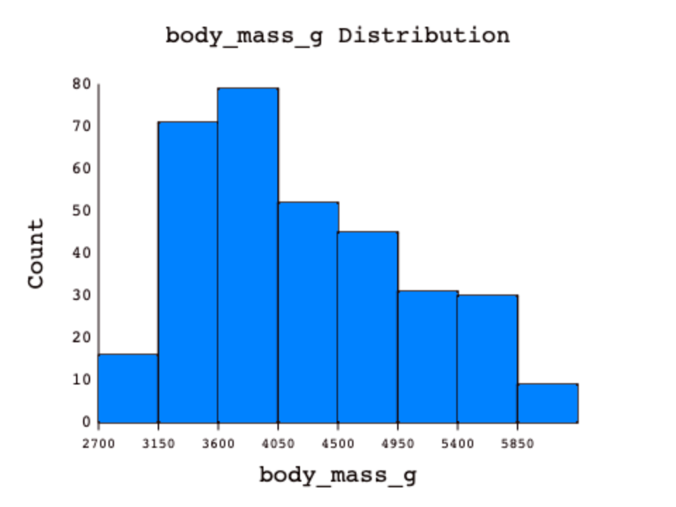
Let's say we wanted to see the body mass distribution for all penguins in the dataset. To do so, we would need to group the data by the body_mass_g column
and then visualize it. The difference is that for horizontal bar plots, the categorical variable already has natural groups, but with a numerical variable,
you can think of each row's group as the bin it falls into when binning. This grouping/binning happens automatically when you call the histogram block
(using the GROUP block), but in other languages you will have to do the grouping/binning yourself before visualizing.

Using the number of bins argument, we can see the same numerical variable binned into a different number of bins:

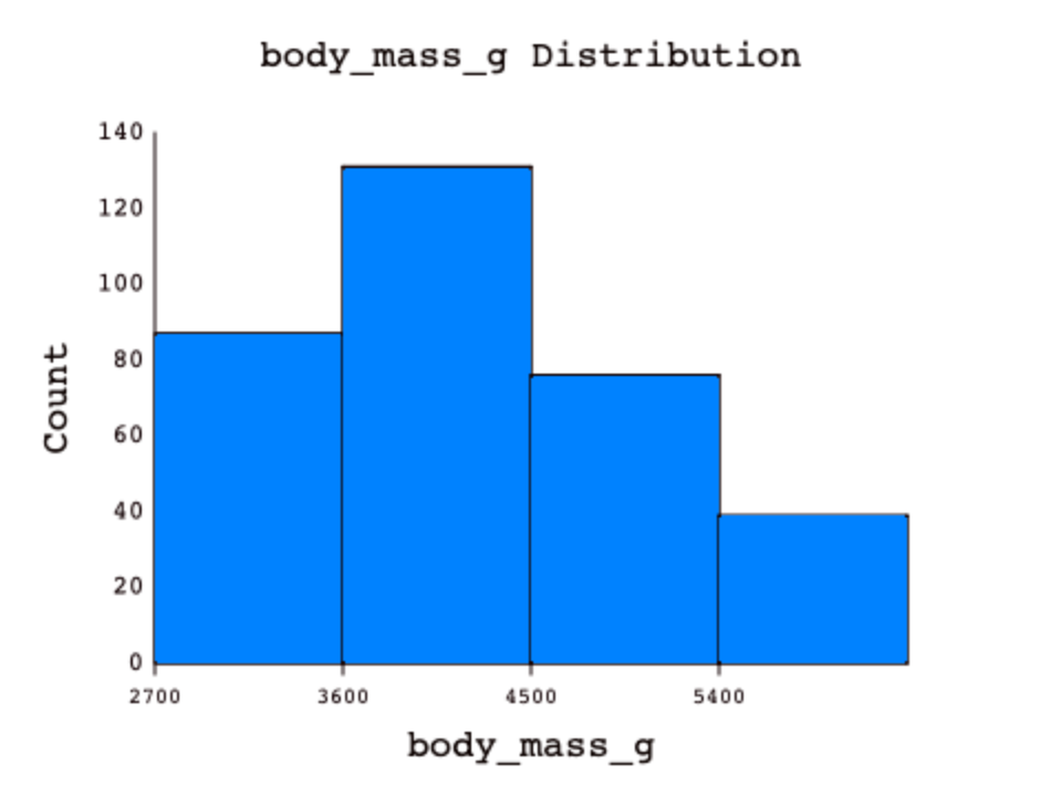

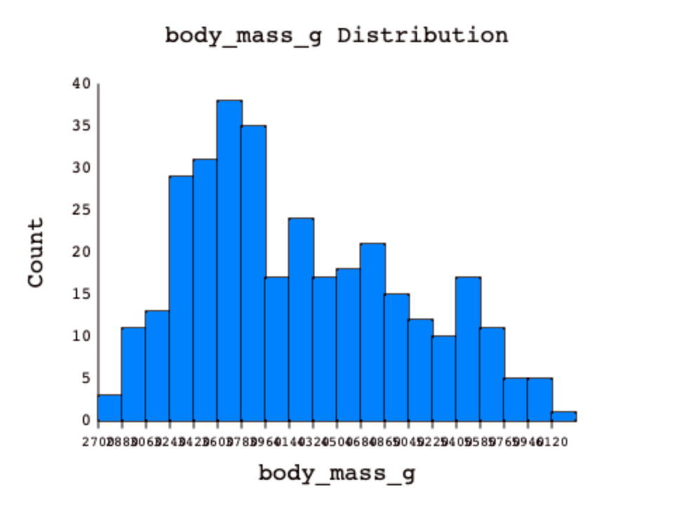
Using a proper number of bins is an important part of making a good histogram. The fewer bins you use, the more difficult it can be to see the true distribution, but the same is true for using too many bins. With too few bins, a lot of different values fall into the same bins, but with too many bins, each row could potentially have its very own bin or make the x-axis difficult to read due to overplotting. This is why it's important to pick an appropriate number of bins, or let DASIS decide if you are not sure.
Overplotting happens when some part of your plot becomes difficult to read. The visualization may be correct, but if people cannot read the plot, it defeats the purpose of visualizing the data in the first place.