
The first data visualization technique we will cover is a horizontal bar plot. Horizontal bar plots are used to visualize a categorical
variable. Both ordinal and nominal categorical variables can be visualized using a horizontal bar chart.
The horizontal bar block takes in 4 arguments, 2 that are required and 2 that are optional:
Let's look at some standard uses of the horizontal bar block:
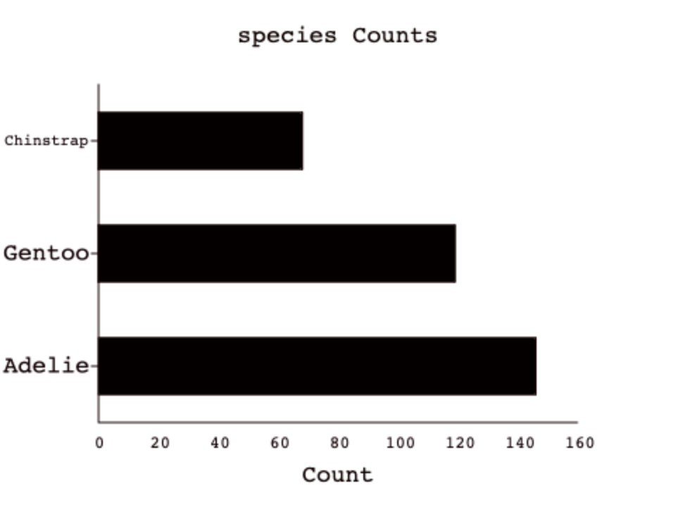
Let's say we wanted to see the species breakdown for all penguins in the dataset. To do so, we would need to group the data by the species column
and then visualize it. In DASIS, this grouping happens automatically when you call the horizontal bar plot block (using the GROUP block from the last assignment),
but in other languages you will have to do the grouping yourself before visualizing.

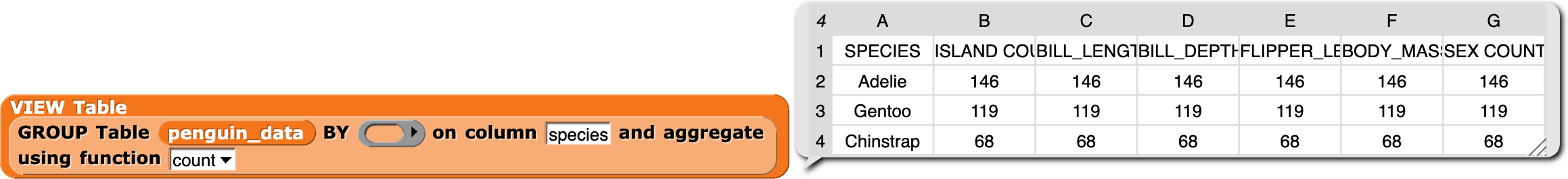
Compare this to the output of the GROUP call on species:
This is the result of calling DASIS's horizontal bar block! As stated eariler, in other languages you would have to construct the GROUP yourself.
There is even more cool functionality of the horizontal bar block! We can even see the breakdown of one column grouped by another column using the optional column label argument:

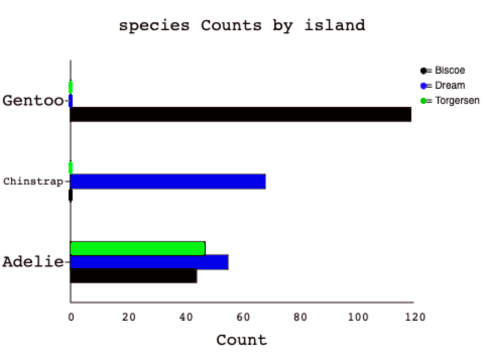
Here we can see the data grouped by island and species. We could also have switched the order of the column label arguments to get this:

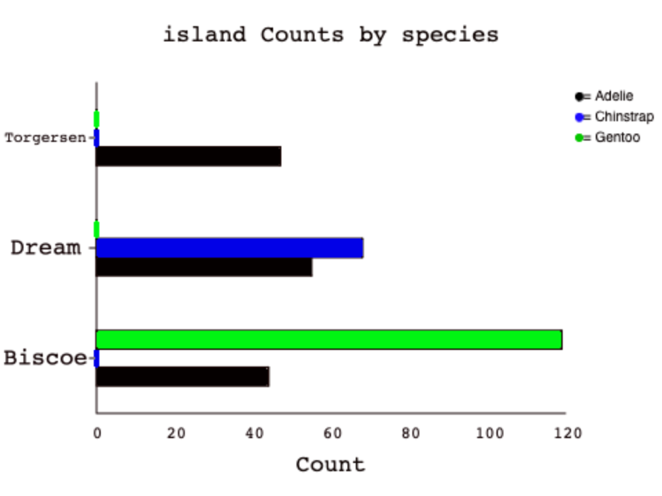
Again, compare this to a PIVOT call that was made under the hood:
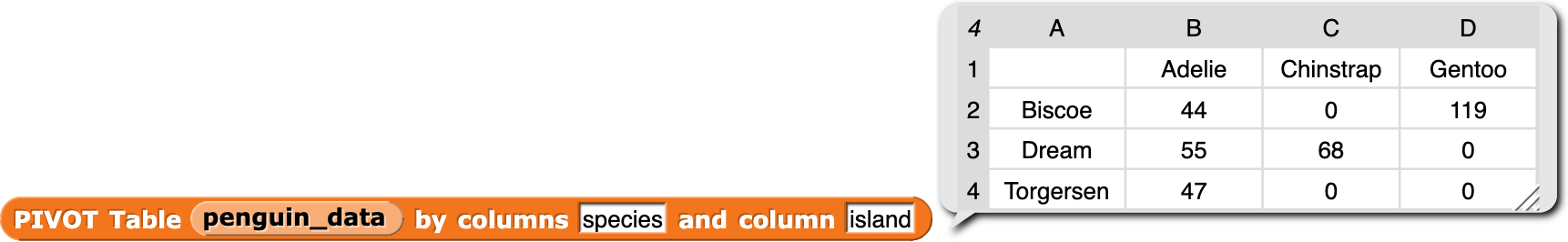
Try and find the bars on each plot that correspond to the PIVOT query above.
Note that the data is the same on both plots, but the ordering can influence how someone interprets the same data. The first plot appears to show us where to find each species, but the second appears to show us which species we would find on each island.